Case study · Brand identity and labels
First bottle, first name.
A bestiary for the Oltrepò Pavese.
When a family of growers becomes a brand: the logo, the labels and the first wine Fratelli Bernini ever bottled under their own name, after three generations in the vineyard.
Three generations before a bottle
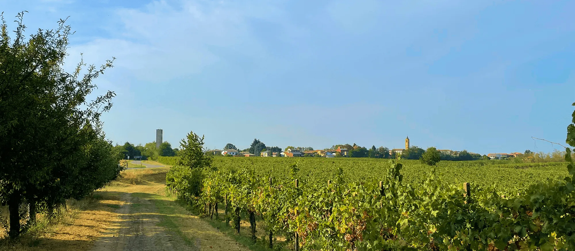
In Bosnasco, in the heart of the Oltrepò Pavese, the Bernini family has worked the land for three generations. For decades their grapes ended up in other people's bottles: growers, suppliers, quiet keepers of an old craft. Then, in 2023, the decision that changed everything — to bottle for the first time under their own name.
They needed all of it: a logo, an image, a way of standing on the shelf. Lupa, a Bonarda from the Oltrepò Pavese, would be the first bottle of their story.
A label, when it is the first one, is never just a label. It is how a family chooses to introduce itself to the world after a lifetime spent behind the scenes. Nothing flashy was needed. What was needed was something true — something that looked like them and like the place they come from, and that could hold up over time, because that first bottle would not stay alone for long.
The logo
The skyline of Bosnasco
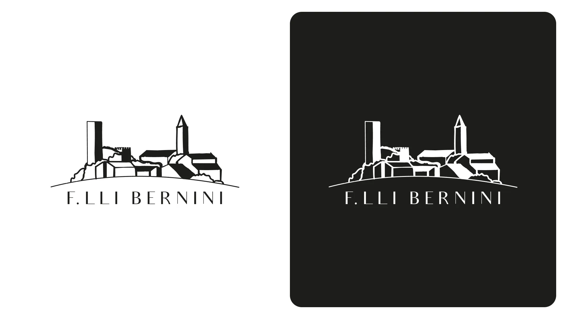
The brief was clear from the start: the logo had to carry the profile of the village, with the family name below it.
A village skyline is a widespread convention in wine: some put in a tower, some the vine-covered hills, some a historical landmark. The risk, when you work inside a convention, is disappearing into it. So I looked for the point where that convention could become theirs and no one else's.
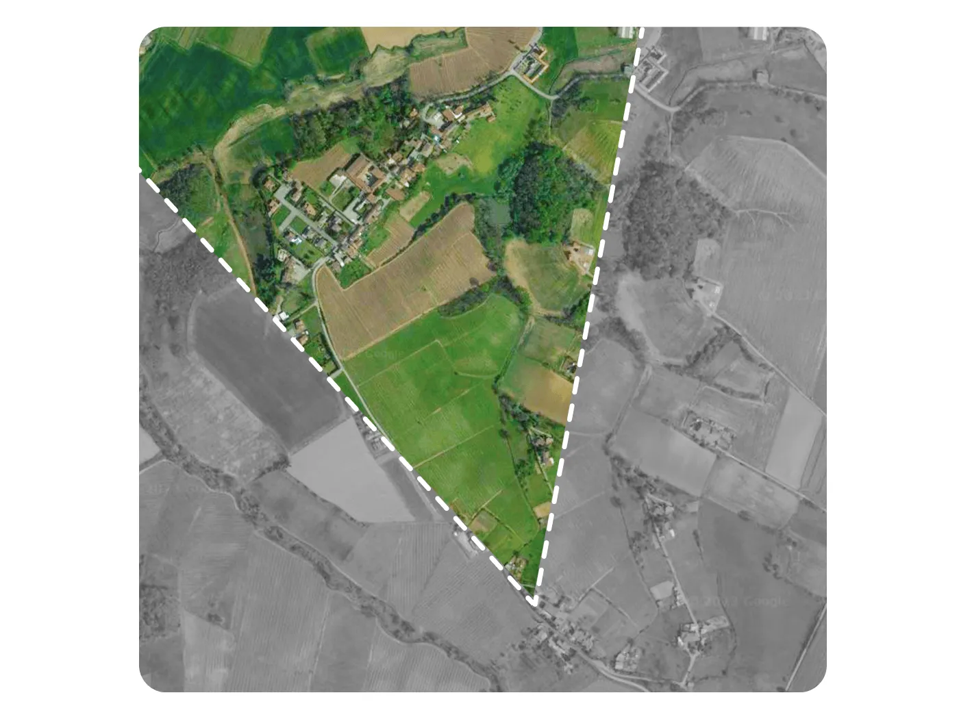
I found it in the point of view. This is not the postcard version of Bosnasco: it is the village as you see it standing in their own vineyard, looking north-northwest. The place as they see it, every day, from where they work.
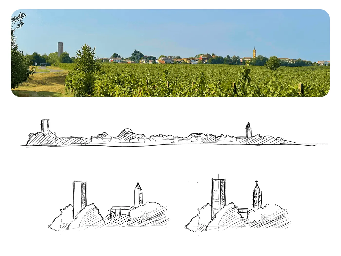
I went and photographed it on site, from the vineyard and from the main street, to work out which elements really define that profile. There are two: the water tower and the bell tower.
A focus, not a photograph
The real view, however striking, did not work as a logo: faithful distances and proportions produced a cluttered drawing, unreadable at small sizes — and a logo lives mostly there, on the neck of a bottle or on a business card.
So I enlarged the water tower and the bell tower and moved them closer together, like pulling a lens into focus: giving up topographic accuracy bought the room for the details that make that skyline recognisable — the rectangular shapes on the tower, the ornaments on the belfry, the distinctive pyramid spire, the clock.
The resulting skyline rests on a curved line that both cradles the family name and echoes the back of an Oltrepò hill: the village above, the land below, the name inside.
Letting them choose
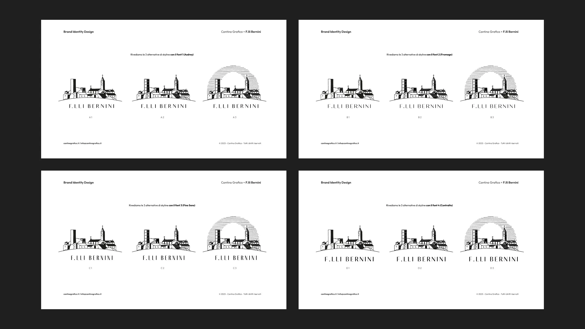
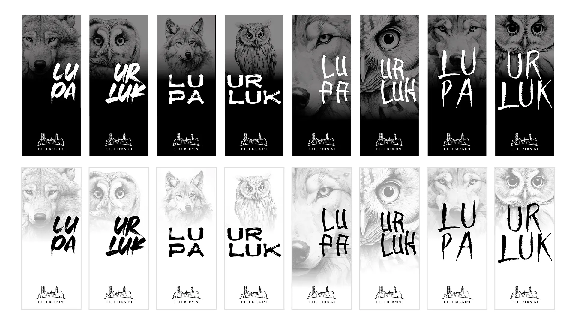
I did not bring a single proposal. I built three versions of the skyline — from the most essential, made of solids and voids alone, to one with shading and raised detail, to one where hatching draws the sky and frames the landscape — and paired each with four typefaces, all sans-serif with strong contrast between strokes, as had emerged from talking with them.
Twelve possible combinations. I showed them in isolation first — just the name set in the four typefaces, with nothing around it that might skew the perception — and then all together, to see how they played.
The choice was theirs. It is a way of working I care about more than authorship: anyone introducing themselves to the world for the first time should recognise themselves in what they choose, not simply accept it.
The labels
A bestiary, one wine at a time
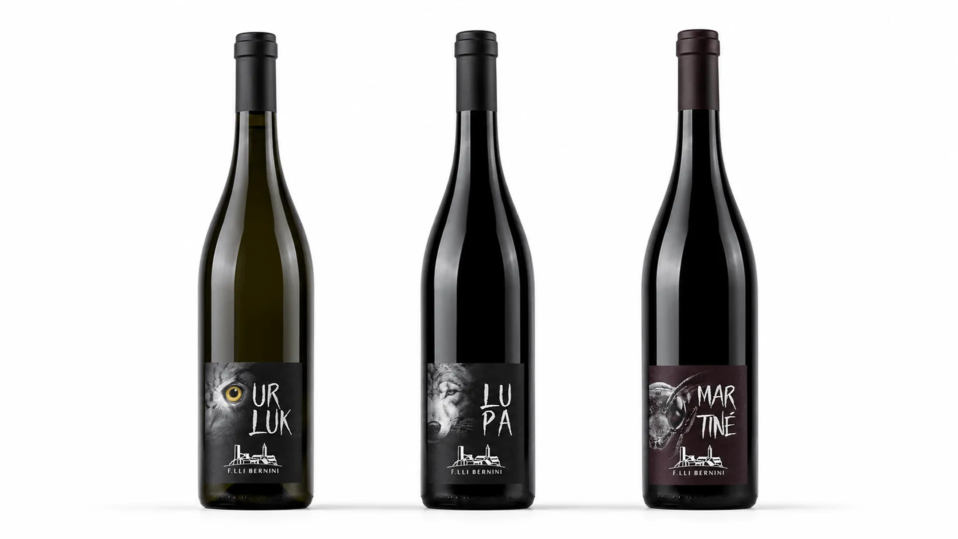
The name of the first wine came from the land, literally: Fratelli Bernini farm a plot called Cascina Lupa — the she-wolf's farmstead. The second wine already had its name too: Urluk, the tawny owl, in local dialect.
Two animals, and a direction: every wine its own creature, always one of these hills and always called by the name people use here. Just as a pencil sketch is the beginning of an idea, those two wines were the beginning of a venture.
And after all, isn't wine itself the medium of something new?
Hence the choice to open the range with animal illustrations, in black and white, with the touch of a pencil.
I knew where we were going; I did not know how far. Martiné arrived, the hornet, and the range stopped being a pair. Milo'rd, the whip snake, is in production and will be the fourth. What had started as the image of two bottles became, one wine at a time, a small bestiary of the Oltrepò: a system where every wine has its creature, its character, its name that tastes of home.
An identity like this is not visible on day one: it is built one bottle at a time.
The work
One hand across the whole range
For the animal imagery I took a route that in 2023 was still uncommon in this field: the base illustrations were generated with artificial intelligence, guided until they reached the mark I had in mind. I put it to Fratelli Bernini in the very first presentation and explained why: the range needed a single hand, a stroke that would stay identical from the first label to the fourth, even years apart.
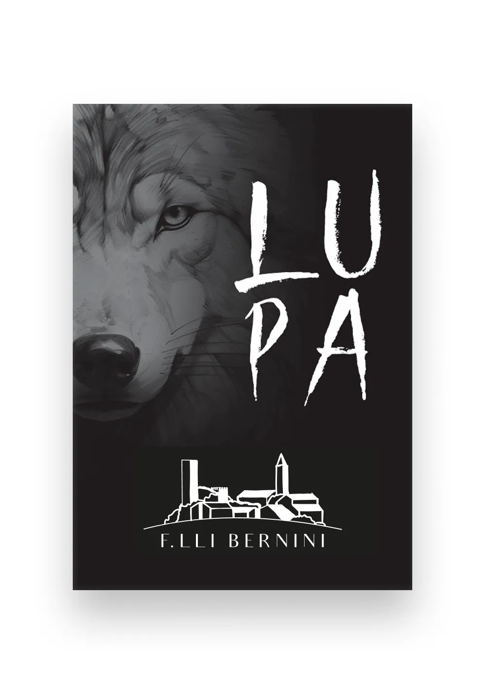
From there on the work was mine: choosing the stroke, working the image, setting it into the composition with the name, the typography and the logo, and keeping the system coherent from one label to the next. The illustration is an ingredient; the label is the project.
Five routes to the same bottle
As with the logo, I explored rather than decided alone. Five label layouts, each with a different tension: the animal set off to one side with the name in calligraphy and plenty of white space; the face clearly visible at the top with a stiffer, squarer typeface; the muzzle in extreme close-up, filling almost the entire label, with tribal, primitive lettering; the animal pulled back with the name written like graffiti, almost rebellious. The fifth combined the imagery of one with the typography of another — and that is the one that won.
Every version was presented in both treatments, on white and on black.
The back label, the print, the millimetres
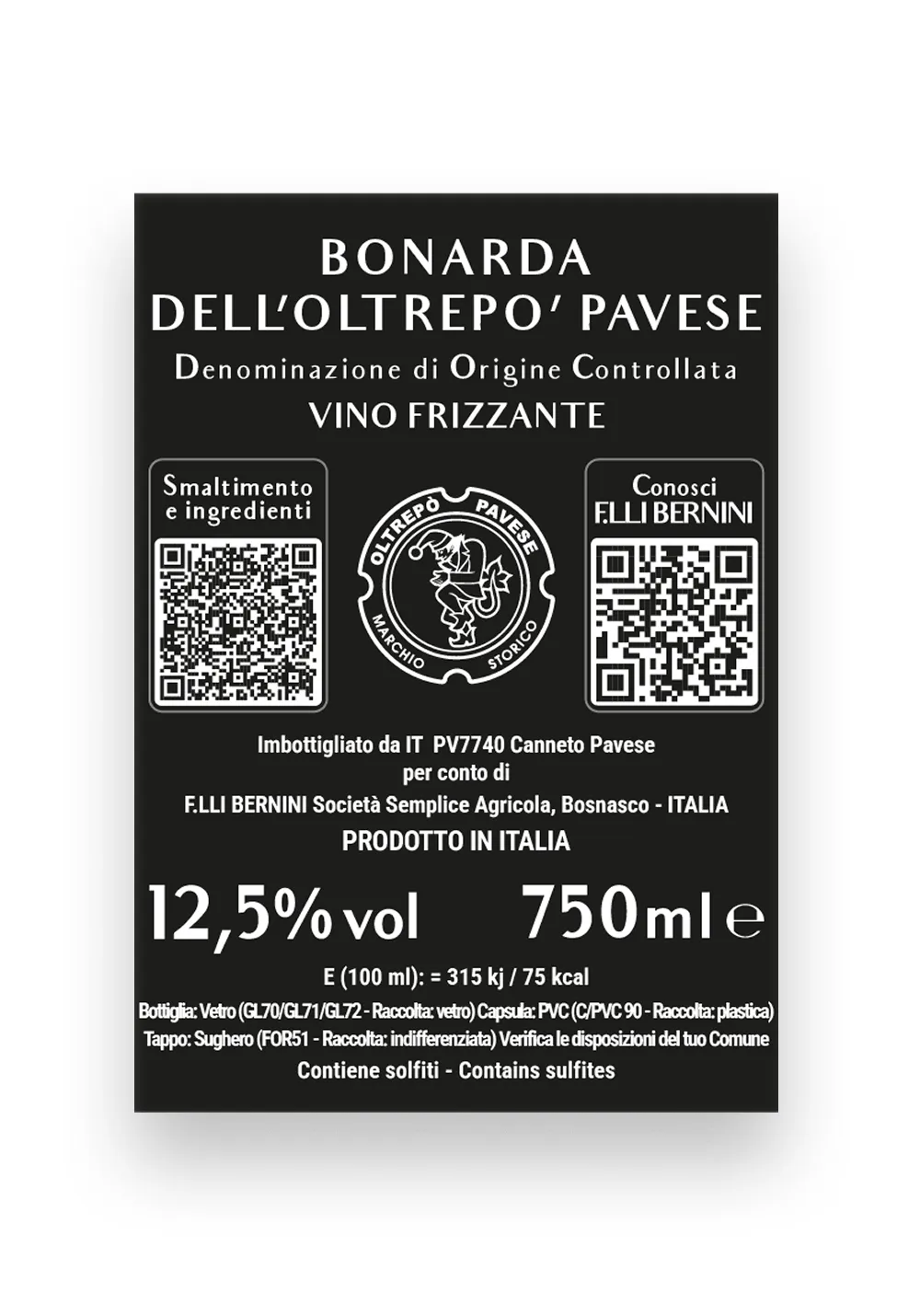
A label is not finished when it looks good. There was the back label to design, with all the mandatory information — appellation, vintage, bottler, alcohol content, sulphites, lot number, QR code — kept consistent with the typography on the front; and the print-ready files to deliver in the formats the printer required, 70×100 and 100×70 millimetres, with the safety margins in the right place.
It is the part nobody sees, and the part that decides whether the project actually makes it onto a bottle.
Recognition
Among the Top Hundred of Golosario 2024
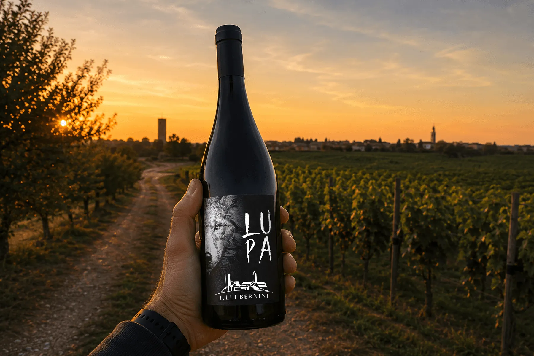
Lupa — the Bonarda that carries this image — was named among the Top Hundred of Golosario 2024, the selection of Italy's best wines in the guide by Paolo Massobrio and Marco Gatti.
The credit, to be clear about it, belongs to Fratelli Bernini's wine. But seeing their first bottling recognised among Italy's finest, on the very first vintage, was a sign that an idea born of the land could really work. And having given that wine its face is, for me, a small but genuine source of pride.
A personal note
New eyes
The world of wine is a place whose appeal I long sensed without really knowing it.
Projects like this one are letting me discover it a little at a time. And perhaps it is precisely because I looked at it with new eyes, without taking it for granted, that I was able to try telling it this way: with the respect of someone approaching, carefully, something older and larger than himself.
Do you have a wine still waiting for its face? Whether it is your first or a new chapter, I would love to hear its story.
Tell me about your winery